PART 1:
1. Personal Background: (5 sentences. Culture, nationality, schooling, important life events, etc.)
Jenny Van Sommers was born in Australia, but now lives in London. She has been living in London for 20 years, and is now doing more painting as well as photography. Jenny’s parents were well educated and wanted her to create a life of her own in which she could support herself. Jenny was encouraged by her fenanist mother not to learn how to cook, clean or sew. In 1998, Jenny Van Sommers moved from Sydney to London, beginning a new chapter in her life: Photography. “My first paying job as a photographer was to photograph the winning chickens at an agricultural show,” Jenny explained when interviewed by Nice That. She became a very successful photographer working for Vogue, Calvin Klein, Prada, and many others.
Name of Artist: Jenny Van Sommers
Dates of Artist’s Life: Can’t find. Alive right now. In an article by The Gardien, it mentions that she started painting when she was 50, so I can infer that she is older than 50.
2. Style: (5 sentences. What visual characteristics does this artist’s work possess? If you can compare it to a painting or art history style please do.)
Jenny Van Sommers’ work is simple and colorful. This is what drew me to her work, the simplicity and beauty of objects colors, especially with the way that Jenny Van Sommers uses light in her photos. One of Jenny’s inspirations is Irving Penn, and he focused on elegant minimalism. I think that Jenny Van Sommers has a similar style in her own way. However, most of Jenny’s photographs are very colorful unlike Irving Penn’s. I think that this has to do with the time periods that they each lived in. Jenny’s photographs are usually very balanced. If her images have more than a few objects, it never becomes too busy because she uses light and arranges the objects in a specific way that is appealing to the eye.
3. Philosophy: (5 sentences. What were the major ideas behind this artist’s work? Where they personal, political, social, etc. What were they trying to “say” with their photographs?)
Jenny Van Sommers work is personal. Jenny Van Sommers does work with companies, but I think that in her personal photographs, she is trying to show the beauty in simplicity. For example, in the picture below with the painted bunny, there is only one color (not including white), and one shape. Even though there are few elements, the photo still draws your eye and is beautiful. This was one of my favorite photographs of hers because of the simplicity.
4. Influences: (5 sentences. How has the photographer influenced you in your work or who were they influenced by?)
Jenny Van Sommers states in an article by Nowness, that her biggest influence was Irving Penn. She spoke about how he was still taking moden photos at age 94! I think that you can tell that Jenny was influenced by Penn because of her many minimalistic photographs. She influenced me because I love how the beauty of simplicity comes out in her photos. She influenced my masks pictures the most because I decided to take photos of simple objects, but make them pop with one bright color, just as Jenny does with some of her paint, or clay photos.
Part 2:
5. Compare and Contrast: You will need to compare and contrast your final 3 images with the 3 images you choose by your photographer. Write about each piece (3 sentences.)
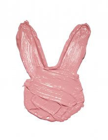
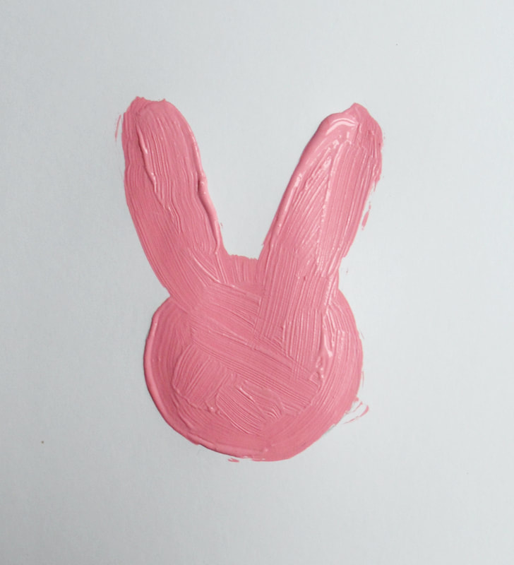
Untitled (bunny painting) Pink Happiness
(Original Image on the left)
This photo was hard to recreate because I only had a little bit of paint, so I couldn’t make the layer as thick as Jenny Van Sommers did. Also, I had difficulty with the background. I found some white paper to paint on, however it looks very grey in the photo, unfortunately I couldn’t paint straight onto our white countertops, so I had to settle with a greyish background. Overall, I like how this photo turned out, I think that the overall shape of the bunny is very similar and the shade of pink is also similar.
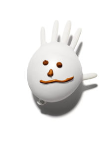
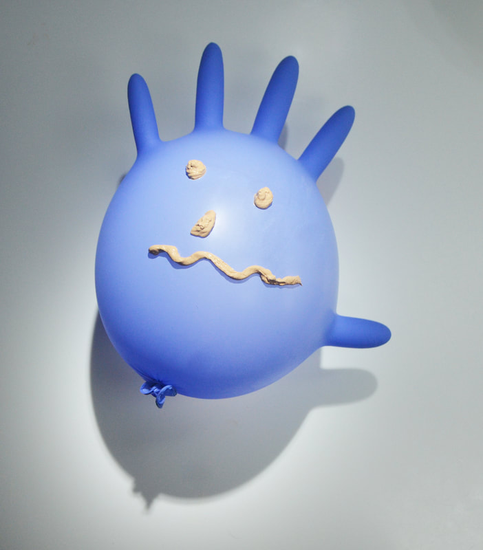
Untitled (glove emoji) Coming Alive
(Original Image on the left)
This picture was very hard to recreate. First, I was lacking the supplies, I only had a blue glove, and my paint was way too runny. I solved these problems by mixing the paint with greek yogurt to get a thicker consistency. I think that that worked, however it did make the paint more matte. This was a better solution than the paint dripping, so I kept it. Also, the glove was very hard to set up. I had to use different contraptions underneath to keep it up. Eventually I settled on a card to prop it up. Another challenge that I faced was the shadows. When I first started photographing there was no shadow, but I looked back at the original photo and saw that there was a shadow, I used a flashlight to recreate the shadow, however this did create a little glare. I thought that the shadow looked nicer even with the glare. Even though this picture is the farthest to the original recreation, I did my best and am happy with this work.
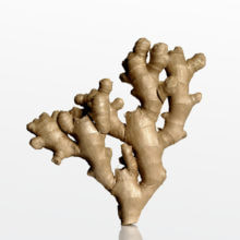
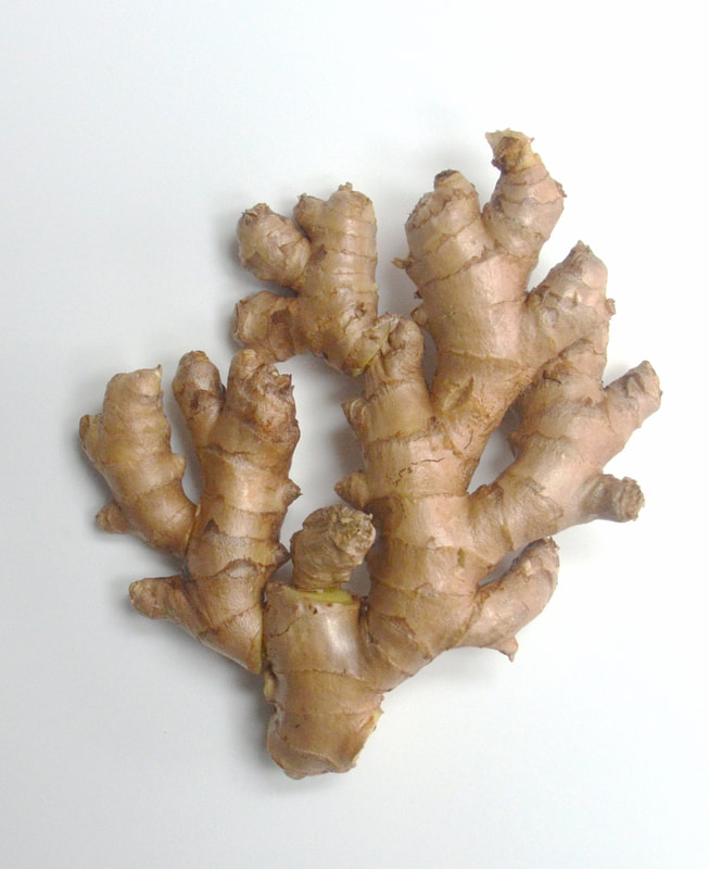
Untitled (ginger) Ginger Tree
(Original Image on the left, image quality got degraded when uploaded, original linked in sources)
Finally, this photo was the easiest to recreate, but the most time consuming. To make this photo look most like the original, I first washed the ginger to get off any dirt. Then I started constructing a similar figure to the original. I tried my best, cutting the ginger and attaching pieces with toothpicks. Obviously, I couldn’t get the exact replica because ginger is a natural form. I think that with the materials given I did the best that I could. This is my favorite photo that I recreated because I paid attention to the little details and made a similar photo to the original.
6. Personal Artist Statement: Your images should tell a story. In 5 sentences tell me about your images. Use Visual Literacy vocabulary to enhance your report.
My images (all on the right) tell the story of beauty in simplicity. I think that this is something that Jenny Van Sommers does a lot in her photos. The bunny has only one element, the paint yet it shows vibrance and energy. The glove is an inanimate object, but a little paint brought it to life and I think that it is very appropriate during the pandemic. Showing that even in the darkest of times people find the light. Finally, the ginger photo represents beauty in nature, ginger is often portrayed as “ugly” because it has so many imperfections and bumps, however these can be beautiful. This is a representation of people, many people try to be “perfect” instead of embracing their imperfections.
My images (all on the right) tell the story of beauty in simplicity. I think that this is something that Jenny Van Sommers does a lot in her photos. The bunny has only one element, the paint yet it shows vibrance and energy. The glove is an inanimate object, but a little paint brought it to life and I think that it is very appropriate during the pandemic. Showing that even in the darkest of times people find the light. Finally, the ginger photo represents beauty in nature, ginger is often portrayed as “ugly” because it has so many imperfections and bumps, however these can be beautiful. This is a representation of people, many people try to be “perfect” instead of embracing their imperfections.
7. Resources: Cannot be Wikipedia. You need to include where you found the information about your artist, provide a link and/or article title.
1. This is Jenny Van Sommers personal website, this is where I found the bunny painting picture that I decided to recreate. https://www.jennyvansommers.com/new-page
2. This is Whyatt Clarke + Jones’s website, I found a section of Jenny Van Sommers work. This is where I found the ginger and glove photos. https://wyattclarkejones.com/artist/jenny-van-sommers/?sec=archive
3. This is an article about Jenny Van Sommers from The Guardian I found a lot of her personal background in this article. https://www.theguardian.com/artanddesign/2020/jun/15/going-bananas-in-lockdown-photographer-jenny-van-sommers-fruit-obsession4. This is an article from Nowness, I found this helpful in finding Jenny Van Sommers influences. https://www.nowness.com/story/photographer-jenny-van-sommers-still-lives
5. This is an article by Mutual Art. I found this article helpful with Jenny’s personal background. The source quoted Jenny Van Sommers about her first paying photographer job. http://www.mutualart.com/ExternalArticle/Say-Cheese--Meet-the-Gourmands-Latest-Co/3873DB3373AEDD4F
